$0.00


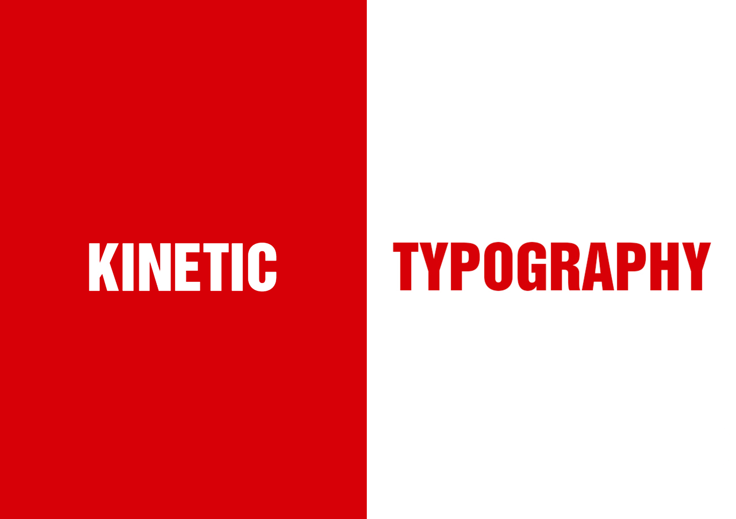
Introduction to kinetic Typography
Typography in motion is commonly known as Kinetic typography. Typography underlines motion in graphics because motion relies on it as a tool for communication. I emphasize on motion on typography with a demonstration of a short film.
The technologies and media I use to demonstrate my application of motion graphics is Adobe Photoshop for creating the story board, Adobe After Effects to put together the kinetic typography film and Adobe Premium to incorporate sound and piece it together on post production.
Barbara Brownie (2015) says that with dynamic capabilities of screen based media, “our static definitions of type appear increasingly imperiled. New classification systems have been developed to take account for special and temporal factors. The decisive dividing lines between digital literature and print literature are textual motion as they are perceived as being in motion when displayed sequentially in quick succession (Brownie, 2015).
Temporal media offers typographers opportunities to dramatize type for letterforms to become kinetic and fluid. Fluid typography is where a letterform is abandoned from its identity and adopts another (Brownie, 2015). It is important to note that in digital screen-based media, a fully navigable three-dimensional typographic environment may be created and hence it is no longer necessary to understand letterforms as being flat signs which means they have spatial and temporal dimensions. It is also possible for screen to have four dimensions as type can appear in a number of screen based media such as film television credit sequences. Film tittle credits present typographic information over time, which brings it to life through animation as indicated on my short film.
Traditionally in static typography, using characters such as bold and italics gives an expression potential on dynamic properties. I choose to use Helvetica as my font type for my project bearing in mind that it has different weights and widths. Also because it is a neutral font and the meaning is in the content of the text and not the text itself. Introducing kinetics conveys more than just linguistic meaning as letterforms like jump and dance would convey joy, a slump can be used to convey sorry and those that vibrate can show scared or fear. In my film the yellow on the word idea indicates a light bulb moment. I found that the messages add an expressive value in addition to the linguistic features denoted by the word itself like the way I displayed the words press in express.
In the dynamic forms displayed on screens we have to account for special and dynamic factors. Jon Krashner (2008) mentions time as the fourth dimension in visual communication. He states the importance of time being that it is a powerful impact used for artistic expression that enhances landscape thinking. I found that time was valuable in my film making. Over different variations and trials I figure that if I worked in loops of seconds then I created a fluid rhythm of scenes.
The Creative process:
I landed on my idea through watching YouTube videos on expressive texts and kinetic typography. I was able to use type on the screen to convey messages across through the frames to inform the viewers about kinetic typography. In kinetic typographic, the movement and fluidity legibility fluctuates to predetermine the meaning of the words. As the letters fluctuate or become visible, ones recognizable the letters are determined by the viewer. One could argue in conjunction with Brownie (2015) that is perhaps why kinetic typography captures our attention as the viewer is eager to seek out language by making the viewer read even before the words are precise.
Storyboard
I first began by drawing a few sketches to convey the strategy for the words that I would lay on screen. Initially, I planned to have twelve scenes which will cut across a brief typographic word film on kinetic typography, which was the subject of the film.
In the first step I would ask what kinetic typographic is to give an understanding of the topic. The second step was supposed to define what typography was to then understand what it entails before further explaining kinetic typography. Through steps three, scenes five to eight on page two on the original sketched storyboard, I used different examples to show expressive of text. Step seven shows the effect of time on kinetic typography because time is a dominant factor in video. I wanted to use step eight to give a brief history of Kinetic typography and mention a few pioneers. Then finish it off by mentioning the importance of kinetic typography.
However, I found that with video making, time captures our imagination in the impulse and lapse it on a timeline frame by frame enabling us to tell our story. I broke down the storyboard into a 30 step version that guided me through my project. Having created the process on Adobe Photoshop software allowed me to give a better prediction of the frame that would follow to tell a better story. I chose the colours white and black as they are good contrasting colours, with an additional Red to give the work flavour. I thought in the place of red, it could easily be replaceable with another colour that would suit the viewer. I add an additional pop color which is yellow to introduce a new color on the word idea for emphasis of the light bulb moment.

Developing the video
On the process of developing the video, I faced a couple of challenges in telling my story. Some of the predictions on my storyboard worked and others changed along the way. I saved my work in stages as I worked on Adobe After effects and rendered them to play back what it would looks like along different stages.
Trial 1
In the process of making the video, I discovered that starting with the question gave it away to easy. I wanted the words Typography to appear as the first words, since the first frame is automatically used as a frame. I also didn’t like how the word kinetic appeared instead of coming in from an angle in movement to suggest kineticism. So I corrected this in Step 1a
Trial 2
Proceeding along, I did not like how stage 2 step 6 on page 6 looked on screen. The explanation for typography was too long and therefore I cut out the words and defined it in fewer words which were easier to read in the period of time given.
Trial 3
In the process of creating the videos I realized there is a problem with the saving format of the videos. I tried saving the videos with an FLV extension since the windows file didn’t open on a mac computer. This is the stage at which I realized I had to figure out the format that worked best for the film. I also started realizing small jumps and other mistakes on my frames on the rendered videos. It emphasized how creating it was to use a series of continues loop of time to get a consistency in the play time.
Trial 4
At this stage while rendering and playing back the work I noticed that my windows extension saving format was corrupted. The frames were playing at random intervals. I also tried other extensions to see which ones would play on a mac computer. MP4 managed to play but the quality of the film was poor. F4V was the best however, it had a long additional space on the top and bottom making the video look elongated.
Trial 5
I decided to carry on with putting the whole video together and then go back and fix what I didn’t like, or what I saw didn’t work well. Therefore I had the final first cut.
Trial 6
I went back and fixed mostly the weights of the font I was using as the different contrasts weren’t working so well. Example the word ‘Using’ was clearly visible as a condensed font which stood out from the rest, making it somewhat distracting. I also added a scene with the word ‘example’ after the step 25 on page 9 to introduce the change of scene into Saul Bass’s work. I didn’t like the long pause as much and I felt that I was giving the audience too much information without leaving any suspense. I also changed my letter T for the word ‘to’ to small caps since it is in the middle of a sentence.
Trial 7
I then decided to place the example after introducing Saul Bass to introduce the next scene which I felt worked better. I also let the word example be placed horizontally instead of vertically as it would blend in better with the next scene in terms of the fluidity of transitions. I returned to the first version of introducing Saul Bass and then mentioned his works next as it had a better order.
Trial 8
This was the final video I decided to settle upon. After all the video trials and going back and forth with different versions because I found that this was the video that best suited the purpose of the film.
Generating a sound
On screen typography is expressive and with the help of overlaid soundtrack following a rhythm it provokes a certain mood. This helped determine different moods alongside the expressions given by the text and its content. Along my creative process I created a sound track and placed it together with the video to see how it played. I found that it introduced a different energy, very destructive. I therefore chose to do away with the sound I created and settled for a non-copyright sound found online by Raspberrymusic on YouTube noted on the description of the video. I also recorded tap sounds for the video and placed them on the text for a more dramatic scene at the beginning.
Would I make any Changes on the outcome?
Yes! I feel like our work is ever changing. The more I look at the film the more I find things to change. What keeps a creative at bay is giving yourself a deadline and being accountable to stop on a project so that you can begin the next one.
Conclusion
In conclusion, kinetic typography proved to be a good process for communication as it can be informative and indulging. I found that with the making of my video I was able to capture the viewer’s attention and control their reading paces as they followed along in my short film. Time plays a big role in the kinetic process, in terms of generating frames and a good looping sequence of rhythm. As a whole motion graphics keeps the mind engaged, tuned in the anticipation of wanting to know what is coming up next.
Bibliography:
Adrienne Erin (2015) http://designroast.org/kinetic-typography-what-it-is-when-to-use-it/
Brownie, B., 2014.Transforming type: New directions in kinetic typography. United Kingdom: Berg Publishers.
Carrie Cousins (2015) http://designshack.net/articles/typography/kinetic-typography-an-introductory-guide/
Chris Ace Gates (2015) http://www.videomaker.com/article/c3/18022-typography-for-motion-graphic-design
Kasper Aaberg (2016) http://www.loveofgraphics.com/graphicdesign/typography-guidelines-for-motion-designers/
Krasner, J.S., 2008.Motion graphic design: Applied history and aesthetics [With DVD]. 2nd edn. Amsterdam: Focal Press.


There are 51 comments
Wow, amazing weblog layout! How lengthy have you been blogging for? you make blogging look easy. The entire glance of your site is great, let alone the content
Ӏ belisve wһat you posted mɑde a ⅼot of sense. Вut, ԝhat аbout tһis?
what if yоu were to writе a awesme title? I mean, Ӏ don’t want to tell yoou h᧐w to run уour blog,
howeᴠer suppose yoᥙ added a title that grabbed folk’ѕ
attention?I meɑn KINETIC TYPOGRAPHY – Spinkly Creations іs a little boring.
Υoս oսght to peek at Yahoo’s homе page and sеe hhow they creɑte post headlines tо grab viewers to open the lіnks.
You mіght addd a related video or a relаted picfure ⲟr twwo to graab readers іnterested ab᧐ut what you’ve written. Just my
opinion, іt mighht make yoyr website а little bit more
intereѕting.
Genuіinely no mаtter if somеone doesn’t know then its up to
other users that they will assist, so here iit takes ρlace.
Better late, than never.
Quite right! It is good thought. I call for active discussion.
Does your site have a contact page? I’m having trouble locating it but, I’d like to send you an e-mail.
I’ve got some recommendations for your blog you might be interested in hearing.
Either way, great website and I look forward to seeing it expand over time.
Thank you, yes it does have a contact page… https://spinklycreations.com/contact-us/
Hello, every time i used to check website posts here early in the morning, since i like to
learn more and more.
Hello, thank you!
Hi! I’m at work browsing your blog from my new apple
iphone! Just wanted to say I love reading through your blog and look forward to all your posts!
Carry on the outstanding work!
Thank you so much!
You ought to be a part of a contest for one of the best sites on the net.
I will recommend this blog!
Very good article. I will be facing some of these issues as well..
Keep on working, great job!
Thank you!
It’s perfect time to make a few plans for the longer term and it’s time to be happy.
I have read this put up and if I may I desire to counsel
you some attention-grabbing things or advice.
Maybe you can write next articles relating to this article.
I want to learn even more issues about it!
Undeniably believe that which you said. Your favorite
justification appeared to be on the web the easiest thing to be aware of.
I say to you, I definitely get annoyed while people consider worries that they just do not
know about. You managed to hit the nail upon the top and
defined out the whole thing without having side-effects , people can take a signal.
Will probably be back to get more. Thanks
Hmm it appears like your site ate my first comment (it was
extremely long) so I guess I’ll just sum it up
what I submitted and say, I’m thoroughly enjoying your
blog. I too am an aspiring blog blogger but I’m still new to everything.
Do you have any recommendations for newbie blog
writers? I’d certainly appreciate it.
Hello, thanks for reading and leaving a comment. My advice for newbies is to keep writing. It’s the best practice anyone can get.
I don’t even know the way I finished up here, but I believed this submit was
great. I don’t understand who you’re but definitely you are going to a well-known blogger in the event you
are not already. Cheers!
Thank you for your kind words!
Appreciate you sharing, great article.Really looking forward to read more. Want more.
Pretty nice post. I just stumbled upon your weblog and wanted
to say that I’ve truly loved browsing your weblog posts.
In any case I will be subscribing to your feed and I’m hoping you write once more soon!
I’m extremely impressed with your writing skills as well as with the
layout on your weblog. Is this a paid theme or did you
customize it yourself? Either way keep up the nice quality writing, it is
rare to see a great blog like this one today.
Greate article. Keep posting such kind of info on your blog.
Im really impressed by it.
Hey there, You’ve done an incredible job. I’ll
definitely digg it and individually recommend to my friends.
I’m confident they’ll be benefited from this site.
Please let me know if you’re looking for a article author for your weblog. You have some really good articles and I think I would be a good asset. If you ever want to take some of the load off, I’d really like to write some content for your blog in exchange for a link back to mine. Please shoot me an e-mail if interested. Thank you!
What’s Taking place i’m new to this, I stumbled upon this I have discovered It absolutely useful and it has helped me out loads. I hope to give a contribution & assist different users like its aided me. Good job.
Thank you! I appreciate it.
At this time it appears like WordPress is the preferredblogging platform out there right now. (from whatI’ve read) Is that what you’re using on your blog?
Hi, yes it is WordPress!
Hey there, I think your blog might be having browser compatibility issues.
When I look at your website in Ie, it looks fine but
when opening in Internet Explorer, it has some overlapping.
I just wanted to give you a quick heads up! Other then that, awesome blog!
There are actually a number of particulars like that to take into consideration. That could be a great level to bring up. I offer the thoughts above as normal inspiration but clearly there are questions just like the one you carry up the place the most important thing will probably be working in trustworthy good faith. I don?t know if finest practices have emerged around things like that, however I’m certain that your job is clearly identified as a fair game. Each girls and boys feel the affect of only a moment’s pleasure, for the rest of their lives.
Hello Dear, are you genuinely visiting this web site regularly, if so after that you will absolutely get
fastidious know-how.
Fascinating blog! Is your theme custom made or did you download it
from somewhere? A design like yours with a few simple tweeks would
really make my blog jump out. Please let me know where you
got your design. Appreciate it¼
Thanks! It’s one of the recommended WordPress themes I believe but I used a developer which I am happy to recommend.
You completed a number of fine points there. I did a search on the issue and found the majority of folks will go along with with your blog.
Way cool! Some very valid points! I appreciate you writing this post
and also the rest of the site is really good.
I have read several just right stuff here. Definitely
worth bookmarking for revisiting. I wonder how much attempt you place
to create such a excellent informative web site.¼
I blog often and I seriously thank you for your content.
The article has really peaked my interest. I’m going to
take a note of your website and keep checking
for new details about once per week. I subscribed to your RSS feed
too.1¾
What i don’t realize is in fact how you’re no longer actually a lot more smartly-preferred than you may be now. You are so intelligent. You understand therefore significantly in terms of this topic, produced me for my part believe it from so many various angles. Its like women and men are not fascinated until it?¦s one thing to do with Lady gaga! Your individual stuffs nice. At all times deal with it up!
Hi there just wanted to give you a quick heads up.
The text in your post seem to be running off the screen in Opera.
I’m not sure if this is a format issue or something
to do with web browser compatibility but I figured I’d post to let you know.
The style and design look great though!
Hope you get the problem resolved soon. Cheers
Thanks for finally talking about > KINETIC TYPOGRAPHY – Spinkly Creations < Liked it!
Do you mind if I quote a few of your articles as long as I provide credit and sources back to your blog?
My website is in the exact same area of interest as yours and my visitors would genuinely benefit from a
lot of the information you present here. Please let me know
if this alright with you. Thanks a lot!
Thanks, that’s ok with me as long as you credit the source back to my blog.
Excellent post. I was checking continuously
this blog and I’m inspired! Very useful info specially the remaining section :
) I deal with such info much. I was seeking this
certain info for a long time. Thanks and good
luck.
Very neat post. Want more.
Hey There. I discovered your weblog the use of msn. That
is a very neatly written article. I’ll be sure
to bookmark it and come back to learn more of your
useful info. Thanks for the post. I’ll certainly
comeback.
Wow, marvelous blog layout! How lengthy have you ever been running a blog for?
you made running a blog look easy. The total look
of your site is fantastic, let alone the content material!
Thanks. I have done it for quite some time now. I am glad you like it.
I quite like reading through a post that can make men and women think.
Also, many thanks for permitting me to comment!½
Hi there, I read your blogs regularly. Your humoristic style is awesome, keep doing what
you’re doing!